Hi Jaap!
In short: A guest can explore the whole content of ipernity (Photos, videao, articles, etc.), but has no admission for own uploads or comments. (It was broadly discussed underneath former blog articles.)
But keep in mind, please: This is a design study! Comments to the design are very welcome. Questions concerning functions should be discussed separately.
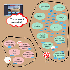
I would have thought at this stage all that needs to be addressed is the actual text element, but as you've asked for opinions my first impression is that it is less informative and less 'clean' than what you are seeking to replace.
As a front page this tells you little about what the site actually has to offer and what you can do through it, whereas the existing version makes it pretty clear what the 'product' offers. But to me this new design layout fails to do that other than to make it clear that ipernity is now an independent platform.
Even then though I'm not sure this is being put across in the most appropriate way. I mean are we really saying that the 'new' ipernity is only about sharing photos?
And if not, does it make sense from the outset to suggest that you can't do the other things, like posting videos and articles, that have in the past made ipernity such a versatile platform?
So, my overall opinion would be that what you're suggesting is okay, but apart from making it clear the site is now independent and adding a long overdue Donate button I'm afraid that's as positive as I can be.
I'd also question why when you are constantly making it clear that the size of the job being undertaken is proving to be much bigger and more demanding than perhaps you or anyone else first realised you are spending time on trying to fix something that wasn't broken?
I'd rather see you getting a newsletter out to all existing users making it clear what has happened with regards Ipernity SA, what is being proposed by the IMA and how all of that is gong to impact on people. In other words, look to communicate more effectively with existing users before you go chasing new prospects.
To me the layout looks nice and clean and I like the link to latest news a lot! Using members' photos certainly is the way to go!
I'd like to see a mention of the blog (article) function somewhere, I think the combination photos with blog is something that sets Ipernity apart from other sites.
You're welcome Bernhard, but I was perhaps hoping for a bit more than that ... that's assuming your reply is as the IMA as opposed to yourself. And if you are talking on behalf of the IMA can I ask if this this going to be the standard response to people whose opinions the 'founders' disagree with or who pose questions you'd rather not answer?
Initial thought is I would like to see the "42€/year" replaced with "Subscription", Potential interested customers might not want to view the platform knowing what the end cost is going to be.
To me the front page with users' pictures is great, and the layout looks ok. Donate button + advertising Ipernity as an independent project & platform is a good idea. It's something to be proud about and should be mentioned wherever possible.
I was also initially confused about the guest thing - as long as I'll still be able to link my profile and gallery to anyone without them having to sign up or join a secret society or something like that, I'm happy.
Absolutely right!
But we also have to offer a (free) access for all those, who get in completely new (via Google, etc.) to get a general idea, don't we?
For me the layout is very clear and very inviting. Hopefully it will encourage new folks to give the trial membership a chance. I can see what red-eye means though.
Using the 'search' icon, can one maybe have a few options e,g. Country, Blog/article, Videos.
Maybe that would be a solution to the points made by Gudrun and Autofantasia (Paul)
Of course all of that would mean extra work for you, and we know that you are all working very hard already.
Hi Paul! It's Friday night, 21:00 CEST. I'm working since 15 hrs. It was my last duty for today to publish the newsflash and the study, which have been balanced ima internally very detailed, as well in content as in wording. If you suspect differences it might be the result of translation problems. (Always keep in mind, please, that I'm not a native speaker of the Englisch language!)
Now I'm private. I only answered some short contributions shortly. Your contribution is very long. You can't expect a qualified answer within minutes. I'll try to do it tomorrow in an adequate manner.
188 comments
bonsai59 said:
Boarischa Krautmo replied to bonsai59:
Jaap van 't Veen said:
Just one quetion: what does this Guest thing mean ??
Bergfex replied to Jaap van 't Veen:
In short: A guest can explore the whole content of ipernity (Photos, videao, articles, etc.), but has no admission for own uploads or comments. (It was broadly discussed underneath former blog articles.)
But keep in mind, please: This is a design study! Comments to the design are very welcome. Questions concerning functions should be discussed separately.
autofantasia said:
As a front page this tells you little about what the site actually has to offer and what you can do through it, whereas the existing version makes it pretty clear what the 'product' offers. But to me this new design layout fails to do that other than to make it clear that ipernity is now an independent platform.
Even then though I'm not sure this is being put across in the most appropriate way. I mean are we really saying that the 'new' ipernity is only about sharing photos?
And if not, does it make sense from the outset to suggest that you can't do the other things, like posting videos and articles, that have in the past made ipernity such a versatile platform?
So, my overall opinion would be that what you're suggesting is okay, but apart from making it clear the site is now independent and adding a long overdue Donate button I'm afraid that's as positive as I can be.
I'd also question why when you are constantly making it clear that the size of the job being undertaken is proving to be much bigger and more demanding than perhaps you or anyone else first realised you are spending time on trying to fix something that wasn't broken?
I'd rather see you getting a newsletter out to all existing users making it clear what has happened with regards Ipernity SA, what is being proposed by the IMA and how all of that is gong to impact on people. In other words, look to communicate more effectively with existing users before you go chasing new prospects.
Bergfex replied to autofantasia:
Thank you for your opinion!
Gudrun said:
I'd like to see a mention of the blog (article) function somewhere, I think the combination photos with blog is something that sets Ipernity apart from other sites.
autofantasia replied to Bergfex:
HappySnapper said:
Bergfex replied to HappySnapper:
Veterok said:
I was also initially confused about the guest thing - as long as I'll still be able to link my profile and gallery to anyone without them having to sign up or join a secret society or something like that, I'm happy.
Bergfex replied to Veterok:
But we also have to offer a (free) access for all those, who get in completely new (via Google, etc.) to get a general idea, don't we?
Amelia said:
Using the 'search' icon, can one maybe have a few options e,g. Country, Blog/article, Videos.
Maybe that would be a solution to the points made by Gudrun and Autofantasia (Paul)
Of course all of that would mean extra work for you, and we know that you are all working very hard already.
Bergfex replied to Amelia:
Inspiring proposals! Thank you!
Bergfex replied to autofantasia:
Now I'm private. I only answered some short contributions shortly. Your contribution is very long. You can't expect a qualified answer within minutes. I'll try to do it tomorrow in an adequate manner.