Picmonkey is a great tool for an amateur photographer like me. But I have discovered it matters a lot on which order and how different effects becomes used. For example 'Basic Edits > Auto adjust' works well on most of the cases, but quite often it makes the image too bright. Instead it is better to choose 'Basic Edits > Exposure > Auto adjust'.
One also should not forget 'Basic Edits > Colors > Neutral picker'. By choosing the "reference value" from one of the spots, which should represent the pure white or gray, the overall color temperature can be fixed easily.
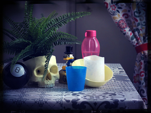
Finally one should consider rotating the image before adding one of the fancy frame effects. Sometimes the scratches and spots on some frame effects just look better when located more carefully. Moreover, I recommend finalizing the cropping after some of the frame effects.
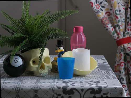
Original:
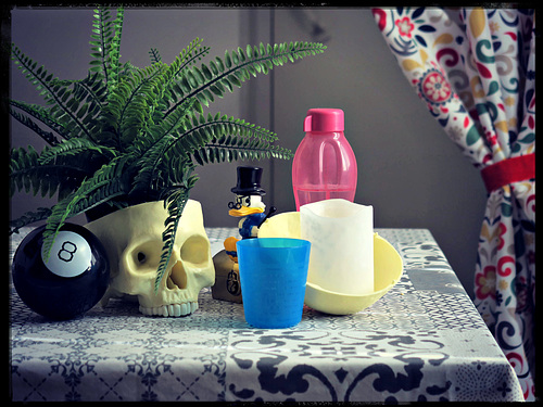
Previous version in colors:
Version in black and white:
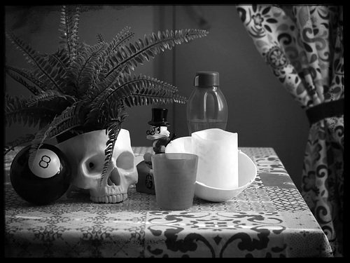
For black and white I recommend using 'Effects > Black and White', and then moving the picker around the 'Contrast filter' to choose what colors should look brighter and which should look darker. This is pretty much like playing with color filters while shooting on black and white film, but much more convenient to do on editor.
P.S. If there is some particular Picmonkey frame style you like, which is not supported on the used aspect ratio, then try this: Resize the image by forcing it to the required aspect ratio, add the frame, and then resize back to original aspect ratio. The quality loss for example between 4:3 and square is most likely unnoticeable.
9 comments
Ulrich John said:
Sami Serola (inactiv… replied to Ulrich John:
neira-Dan said:
Sami Serola (inactiv… replied to neira-Dan:
C'est un plaisir de partager des idées.
Erika Akire said:
www.ipernity.com/group/picmonkeycreative
Sami Serola (inactiv… replied to Erika Akire:
As you may have noticed, there is again discussion going on what all groups are worth to have:
www.ipernity.com/blog/team/4725850
Group like this looks like a great place to share tricks. Members on that group should consider become even more active to share also "howto" information either on their image caption or on group discussions ;-)
╰☆☆June☆☆╮ said:
Have a great day/evening.
Valfal said:
Boarischa Krautmo said: