(Visitors: Please use DeepL Translator or install an add-on that suits your browser.)
 Sometimes when we ask our members to submit photos for the ipernity homepage, they answer: "I don't know it at all. I've been a member of ipernity for many years and never visit the homepage." Or: "I'm not interested in our homepage. I am permanently logged in. I just want to be in contact with other like-minded people here." There is nothing wrong with such answers. Because this is exactly the purpose of a photo sharing community: to share your photo or video hobby with others. In so doing, over the years, you create networks of online friends in which you feel comfortable.
But like everywhere else in life, such circles of friends are subject to constant dynamics. Every now and then, people who have become familiar to us depart. Or new ones appear who arouse our interest. It is completely normal, in all circles everywhere in the world.
However, in order to continue, it is necessary that the influx of new people compensates for those leaving. Otherwise, a community shrinks to the point where it becomes uninteresting or can no longer afford the cost of the clubhouse. In our case, the clubhouse is our website. For this reason, we permanently have to draw sufficient attention to our activities and inspire outsiders to join us.
One brick in this process is our homepage, which is the subject of this article. Our homepage is not aimed at us members, but at outsiders. It is the medium with which we draw attention to ourselves. Just as a book cover does when we pass a bookstore while shopping. Or when it is casually displayed to us while we are surfing the internet:
www.amazon.de/Up-Date-Dates-machen-keine/dp/3453361067/ref=tmm_pap_swatch_0?_encoding=UTF8&qid=&sr=
Our eyes fall on it, and without even really being aware of what it's about, we click on the online description or pick up the book to read the blurb. It is a split second in which we subconsciously decide: I'm interested, or I'm not interested. And it is exactly the same with our homepage. Whenever someone sees it, it takes a split second to decide whether they find it interesting enough to spend time on the content.
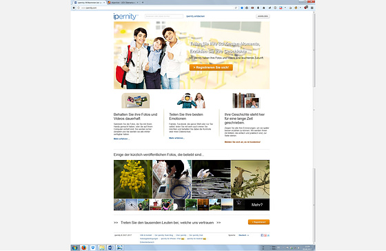
Understanding that there is only ever one golden moment to make a good first impact, let's now take a look at the ipernity homepage from 2013 as we adopted it in 2017:
It was certainly contemporary. Because in 2013, homepages were still designed mainly for PC screens. However, we were faced with two problems in 2017. First, the homepage raised expectations or even made promises that were in no way tenable ("Keep your photos and videos permanently" or "Your timeline is written here for eternity"). Secondly, the imagery addressed a target group that had long since migrated to social media: young families with children.
This sandwich generation is characterised by a lack of one thing above all: time and leisure for hobbies. Everyday life is primarily about the job and the family, possibly about building a house or caring for parents. Communication needs are quickly taken care of on the side via the smartphone. So it is mainly people in the second or third phase of life who have time for more intensive cultivation of the photo hobby and exchange via sharing communities. Our image language on the home page must be directed at them.
For the reasons mentioned, shortly after the takeover in September 2017, the ima team started to discuss how the homepage could be adapted to the further developed conditions. In order to handle the transformation gently, the original design concept should be continued: A large lead image, with a three-part branching underneath. However, with much less descriptive wording to make the page quicker to grasp.
A respective proposal was presented to the community and extensively discussed. The more than 200 responses were evaluated in a structured manner:
www.ipernity.com/doc/team/45656792 (redesign study)
www.ipernity.com/doc/team/45854700 (evaluation chart 1)
www.ipernity.com/doc/team/45854810 (evaluation chart 2)
www.ipernity.com/doc/team/45854844 (evaluation chart 3)
www.ipernity.com/doc/team/45854858 (evaluation chart 4)
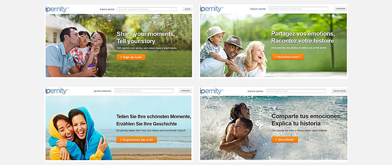
Based on the result of the public discussion, the following new homepage was programmed by our IT service provider Qwellcode GmbH, Salzkotten (Germany) in early 2018:
Of course, this quickly made homepage was not yet perfect. But it fulfilled the most urgent goals in a timely manner:
● No more untenable promises were made.
● The imagery was no longer aimed at the wrong target group.
● The use of images from the community increased the authenticity.
After this immediate action, the homepage was further developed in a relaxed manner in order to express even better what ipernity meanwhile is: The probably largest non-commercial online photo club in the world. Moreover the further develeopment also addressed the challenges that different kind of devices raise for a website.
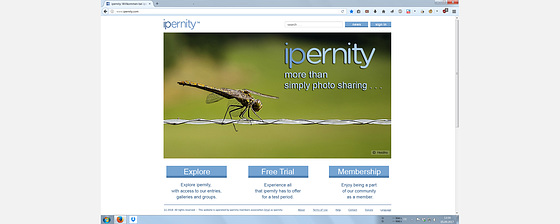
With support of the ipernity member and web designer Spotomy, the following design was developed and has been online since August 2020 (see www.ipernity.com/blog/team/4732766):
This homepage appears on the users' displays in two different versions, depending on the hardware used.
It is available in all seven languages in which ipernity is programmed and leads the visitor to the most important pages via three buttons. The starring images are pictures by ipernity members that are seasonally different.
So while our members might not care much about our homepage, we still need the members' photos to keep the homepage eyecatching to passers-by.
Therefore, as a club member, you are cordially invited to contribute with your photos. You can post the best ones in the group Ipernity Homepage - Picture Proposals. Please note, however, the required picture format (16:9 landscape) and the picture composition. You may find more information on this in the Layout Guidelines for Homepage Pictures.
Bernhard Westrup (bergfex)
Project manager for the relaunch of the homepage 2017 to 2020


11 comments
Guydel said:
J'espère que de nombreux Ipernitiens vont se joindre aux quelques uns qui font déjà leur possible ! Amitiés à toutes et tous ... et au team !
Bergfex said:
Je ne peux m'empêcher de sourire. Car ce n'est qu'hier que j'ai finalisé cette photo de toi:
Photographe: Guydel, www.ipernity.com/doc/delacour83/50899110
Pourquoi je la montre ici : tout d'abord, elle représente clairement un oiseau. Elle fait donc partie de ton domaine d'activité. Deuxièmement, il s'agit d'une photo exceptionnelle à laquelle on regarde à deux fois. En effet, rares sont les personnes qui ont l'occasion de voir un tel oiseau en vol de manière aussi détaillée. C'est ce qui qualifie cette image à des fins publicitaires
Merci pour tes contributions. Continue comme ça !
Bergfex replied to Bergfex:
Annaig56 said:
Toutes mes photos ne sont pas bonnes mais celle-ci je pense aurait le mérite d'y être publiée.
www.ipernity.com/doc/213644/51066300/in/favorite/213644/self
Amitiés à vous,
Bergfex said:
la plupart du temps, ce n'est pas la qualité qui est en cause lorsqu'une image est refusée. Par exemple, rares sont les images du groupe IPERNITY - Images ambassadrices qui parviennent à figurer sur la page d'accueil, même si elles sont toutes triées sur le volet. Ces plus de 800 images sont la crème de la crème d'ipernity.
Le problème vient généralement de la composition de l'image. Les images doivent impérativement être au format 16:9 transversal. Ensuite, le sujet principal doit être en bas à droite. Et troisièmement, il ne doit pas y avoir d'arrière-plan gênant en haut, là où se trouve le logo. Malheureusement, la plupart du temps, l'échec est dû au fait que ces exigences ne sont pas remplies.
Je montre ici six exemples d'images qui ont la composition correcte :
Mais j'écrirai aussi quelque chose à ce sujet dans un autre article.
Bergfex replied to Bergfex:
Le tableau est carré, le regard du spectateur se dirige automatiquement vers l'aquarelle du peintre. Celle-ci se trouve à gauche de l'image. Si l'on charge l'image à titre d'essai dans la page d'accueil, on obtient deux variantes :
Dans l'exemple de gauche, il manque beaucoup de contenu dans l'image. On ne peut pas non plus le faire apparaître comme par magie, car ton image a un format inapproprié.
Dans l'exemple de droite, j'ai beaucoup agrandi l'image, puis je l'ai recadrée. Le sujet principal devrait se trouver là où se trouve la croix. Mais il n'y a que l'arrière de la tête du peintre qui est ennuyeux. Le regard du spectateur se dirige toujours vers le chevalet. Celui-ci se trouve toujours à gauche, même s'il est déjà un peu plus au centre. La composition du tableau n'est tout simplement pas adaptée.
Annaig56 replied to Bergfex:
Bergfex replied to :
En outre, une image à des fins publicitaires doit susciter des émotions positives ou faire appel à des instincts qui sont accueillants.Mais je ne veux pas m'étendre sur ce point ici. Je vais écrire quelque chose à ce sujet.
Juste une chose : la page d'accueil n'est en aucun cas un endroit où vous montrez vos meilleures photos. Elle est un outil publicitaire destiné à attirer les visiteurs étrangers.Elle est un pot de miel.
Annaig56 replied to :
Bergfex replied to :
Mais que penser de la photo en dessous ? La dame avec le chien ? Malheureusement, cette photo n'est pas téléchargeable. Si tu me le permets, je serai heureux de voir comment elle s'intègre dans le masque.
Bergfex said: